Illustrator and designer Stephen Chan created the ‘Space Owl’ character for the cover of Ammo issue 10. I asked Stephen about his approach to the cover artwork, his character designs and recent exhibition in Hong Kong.
Ammo Magazine covers are known for not having set themes (our attempt to give cover artists more creative freedom). What process did you go through to develop your ideas and create the final artwork for issue 10?
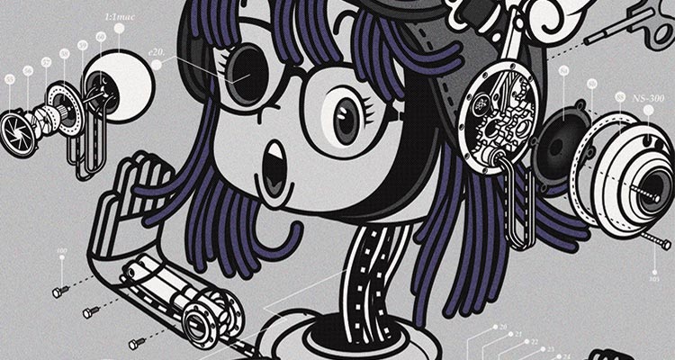
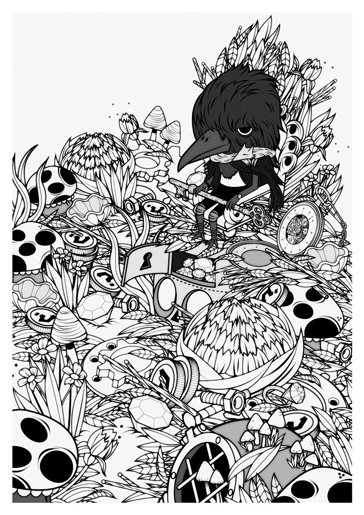
The overall concept for the cover stems from a personal project I’m currently working on (on and off). I had already develop the background story for the Space Owl’s personality, and even created a world for the character to inhabit (which is a very important part of developing your illustrations and characters). I didn’t want it to be ‘today’s vision of the future though, (with 3D Iron Man-esque interactive systems and holographic projections) I wanted something more retro, more nostalgic, with arrays of switches and buttons, levers and wires. There’s even a cassette player and radio.
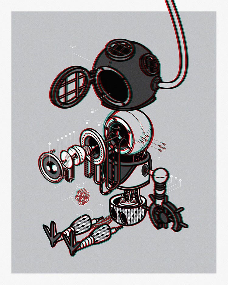
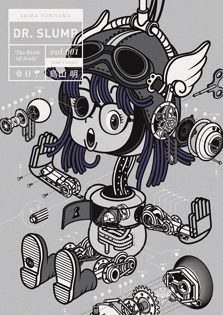
My inspiration comes from the futuristic and mechanical, growing up with animes like ‘Dr Slump’, cartoons like ‘The Jetsons’, TV shows like ‘Red Dwarf, and technical drawings and Info-graphics (drawing inspiration from my product design roots). Well, it’s just a lot of fun illustrating robots and space machinery in general.
A lot of your artwork features prominent central characters surrounded by intricately detailed scenes (Issue 10’s cover is a prime example). This is especially apparent in your newer illustrations when compared to the repeating elements visible in some of your earlier work. Did you purposefully decide to focus on developing character driven artwork or was it a natural progression?
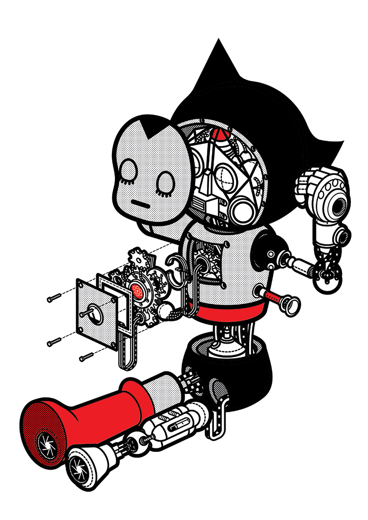
I’m not sure to be honest. It’s not really something I think about too much. You kind of just draw what you want to. I guess you’re right about the focus on central characters though. I want to establish a connection with the audience, and maybe focusing on a central character is way of doing this. The focus is on the character. Every object, every element in the picture helps tell the story and breathe life in to your character, giving them a personality. The little things, the details further strengthen the emotions that you want to convey.
Regarding the amount of detail which goes in to the illustrations, I feel that depends on how I want to communicate with the characters and the scenes. For example, the Typographic illustrations I did for ‘Pick Me Up’ Art Fair earlier this year were very simplified and bold. Those were inspired by childhood times, created to mimic children’s alphabet flash cards, so I used thicker lines and reduced the amount of details and objects usually associated with my work.
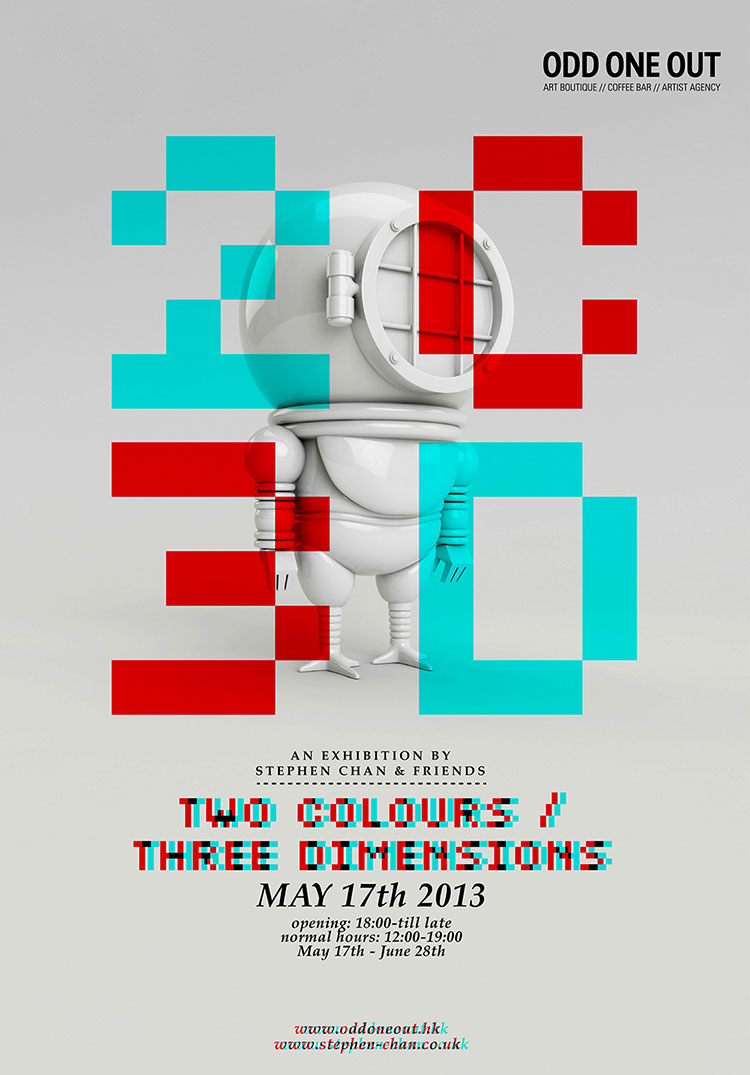
Your recent Two Colours, Three Dimensions Exhibition in Hong Kong looked pretty amazing. How did you find organising a group show and would you do it again?
I don’t think I can describe the feeling I had during those 2 – 3 months with mere words. It was truly a ‘blood, sweat and tears’ experience. It was stressful to say the least, but I guess that was due to myself being too overly ambitious. Organising / collaborating with over 30 international artists, combining 2D / 3D illustration, animations, paper toys and live screen printing in under 2 – 3 months was slightly challenging and probably too much to handle for one person.
But after saying all that, I feel like I’ve gained so much from curating this show. I feel like I’ve moved forward. It was stressful, but fulfilling at the same time. I’ve definitely accomplished and ticked a few things off my creative checklist (the animation collaboration work in particular). I ‘would’ do it again, something more focused maybe, but probably not too soon.
You’re a member of the Brother’s of the Stripe (B.O.T.s) collective and alongside the other members you’ve been involved with some really interesting projects. How did you get involved and what’s next for the B.O.T.s?
I met Joel aka Mister Millerchip, aka Big Bro Chip, a few years ago at an exhibition we were both in. I think it was bro-love at first sight. We just clicked. It was the first time I attended an exhibition and Joel being the superstar pro that he is, took me under his wing and showed me the way. We chatted with a can of ‘Red Stripe’ in hand (which might be the origin of our name) and talked about collaborating on something in the future. A few months later, he messages me with the idea for B.O.T.S and a rag tag band of brothers in tow. In the space of 2 years we’ve put on exhibitions, live draws, and workshops for a range of amazing clients, including Virgin, The London Design Museum, Pick Me Up Art Fair, The V&A, just to name a few.
We’re not planning to stop anytime soon. We’ve been pitching for a few massive events, and putting proposals together for more B.O.T.S shows and group shows. Nothing is set in stone yet, but it seems like next year is going to be even bigger and better for us brothers.
View more of Stephen’s artwork via his Ammo Profile and make contact with him for any collaborations or projects on his website.
